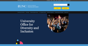
The University Office for Diversity and Inclusion launched its redesigned department website on May 5. ITS Digital Services, UNC Creative and SouthStar Strategies LLC collaborated with UODI on the redesign.
The UODI, which gained its current name in 2018 and moved under the Office of the Provost in 2020, promotes “the principles of equity and inclusion in recruitment, through diversity education and functions, and development programming.”
Starting fresh
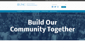
With the redesign, UODI aimed to make its website cleaner, easier for users to navigate and more manageable for UODI staff.
Gia Branciforte, Front End Developer for Digital Services, started building the new website last September.

“Users to this site span the full spectrum of the University community,” Branciforte said. “There are students looking for connection and opportunities, faculty looking for support and training, and prospective students and community members looking for information about how UNC-Chapel Hill is addressing issues of equity and inclusion. Because the user base is so broad, clarity in content and user experience was especially important.”
Collaborative effort
Alyssa Stepien, Art Director for UNC Creative, designed the visual side of the website, which she then sent to Digital Services for development. While making her designs, Stepien gathered and incorporated feedback from the UODI. She also checked in with Digital Services to ensure that the designs were user friendly and accessible.
Stepien enjoys working with Digital Services because she knows the team will produce websites that mirror her designs. “This was an important website to be a part of, and I was really happy with the final product we were all able to produce together,” she said.
Improves user experience
The UODI site now adheres to digital accessibility standards, Branciforte said. Early in the project the teams conducted usability testing to ensure the new sitemap and organization were intuitive. The redesign also improved the user experience to make it easier and faster for users to find the information they’re seeking. Also, the team archived much information and streamlined the information architecture, which enables the UODI staff members to more efficiently manage their content.
The two departments were excellent to collaborate with, said Adrianne Gibilisco, who until recently was Communications Specialist for UODI and has since transitioned to the Kenan-Flagler Business School as Marketing and Communications Strategist for the MBA portfolio. “Recreating a departmental website is a challenge for anyone,” she said. “Having partners — especially internal ones who understand the climate, culture and aim of your environment — truly helps.”
Critical time for a redesign
Other campus units considering redesigns should keep in mind that a redesign isn’t simply changing how the site looks and operates, Branciforte said. A redesign requires a critical look at how a unit represents itself and its values, as well as how it interacts with campus stakeholders. These are all reflected in the look and function of a website.
“We are at a moment in time when our country is grappling with centuries deep issues of justice, equity and access, and our University climate is a reflection of that national cultural awareness,” said Branciforte. “It felt especially important and rewarding to make sure that this new website was designed in such a way that it serves our community members with respect and lives up to the ideals of a public university in service to all.”